Urban Edge
A minimalist skincare brand built to express purity, confidence, and modern self-care through clean visuals, refined typography, and a contemporary tone that resonates with urban professionals.
Brand Foundation
Urban Edge began as a vision to redefine skincare for modern city dwellers—products designed not only for daily routines but for lifestyles shaped by speed, ambition, and personal clarity.
The client wanted a brand identity that echoed minimalism without feeling empty, and sophistication without appearing exclusive. Their goal was to build a label that communicates purity, reliability, and calm in the midst of a fast-paced urban environment.
Our first step was understanding the product's philosophy: simplicity backed by science. From this, we explored a design direction rooted in neutral palettes, precise grid systems, and a calm, confident tone of voice. The foundation set the tone for a brand that feels clean, intelligent, and effortlessly modern.

Design Process
Creating the visual identity for Urban Edge required a process grounded in clarity and refinement. The challenge was balancing minimalism with memorability—ensuring the brand looked clean while still owning a distinctive character.
We started with mood boards that explored contemporary urban aesthetics: structured layouts, soft monochromatic tones, and subtle textures inspired by concrete, glass, and morning light. These visual cues guided us toward a direction that felt grounded, premium, and unmistakably modern.
Key Design Decisions Included:
A soft grayscale palette with hints of warm neutrals
Clean, geometric sans-serif typography for a clinical yet approachable tone
Packaging layouts structured with generous whitespace
Iconography inspired by everyday city shapes and angles
A photography direction centered on natural skin, soft shadows, and minimalist settings
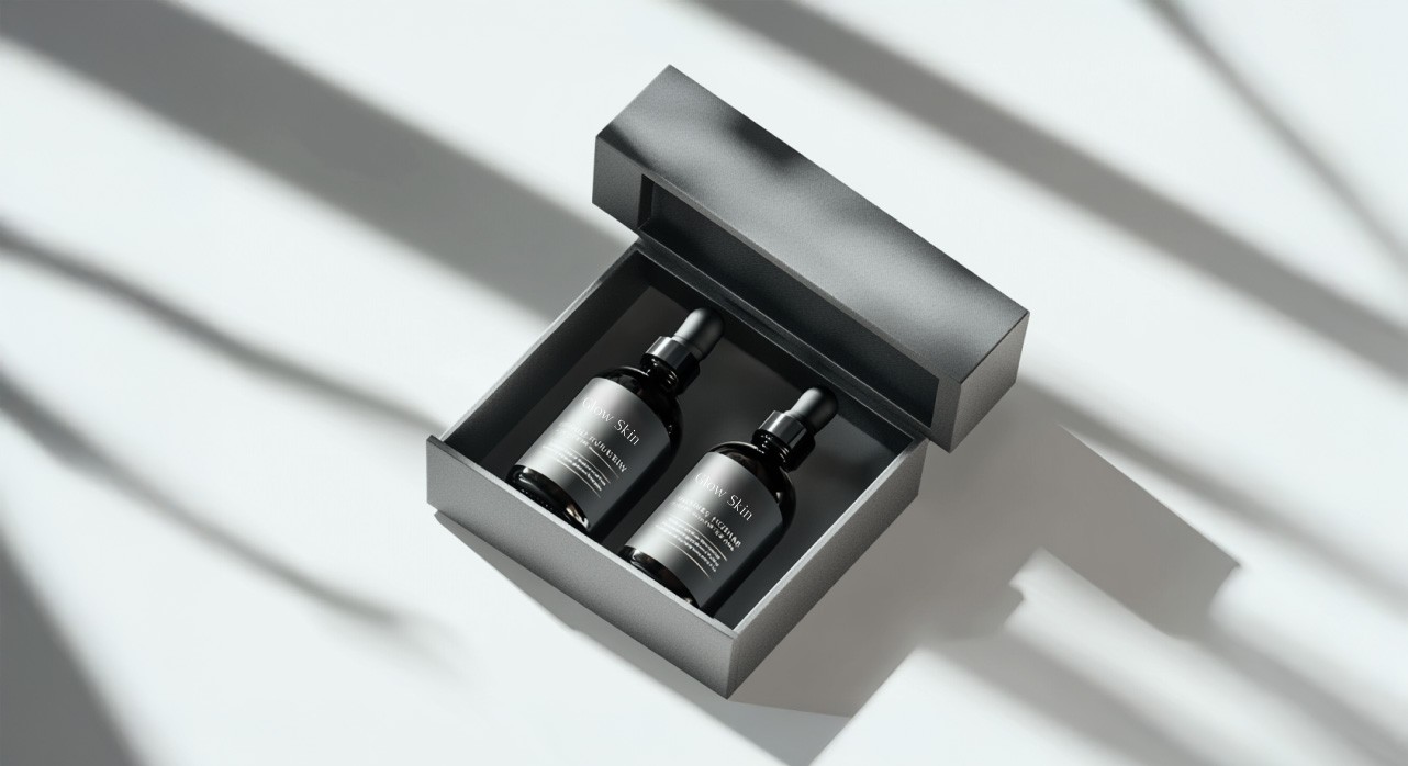
The packaging became a core focus. We designed it to feel like an extension of the user's lifestyle—something that sits beautifully on a bathroom counter or inside a work bag. Strong alignment, subtle contrast, and micro-typographic details created a sense of intentional craftsmanship.
“Minimalism isn’t about removing design — it’s about elevating what truly matters."
Digital assets, including website mockups and social templates, followed the same structured rhythm. Calm spacing, quiet color use, and confident messaging established an identity that communicates trust with very few elements.
Each touchpoint worked toward one idea: giving users a sense of quiet confidence. Urban Edge became a brand that respects the user’s time, space, and attention. Through a restrained yet precise design system, the brand presents skincare as a calm moment within a busy urban world.

Project Outcome
The final identity for Urban Edge delivered exactly what the client envisioned—minimalist, refined, and deeply aligned with the lifestyle of their target audience. The brand now feels clean yet emotive, modern yet timeless, allowing it to stand confidently among premium skincare labels.
The cohesive design system provides long-term flexibility, supporting future product lines and marketing expansions without losing its core visual DNA. Early testers and focus groups responded strongly to the understated aesthetic, noting that the brand "feels calming" and "instantly trustworthy."
Urban Edge now stands as a skincare brand shaped for the modern world—elegant in form, effortless in function, and unmistakably intentional.